In most websites tabbed menus are used to help save space and improve user experience. It's actually very simple elegant to have content organized with tabs.
Although it's not often, sometimes, websites adopt this technique for their main layout.
In this tutorial I will consider we're creating a widget. We'll be using the normal HTML radio buttons to handle the activation of each tab and its content.
Before we continue, have a look at what we'll be creating:
Usually to produce this effect we can use JavaScript to handle the user click, get the element selected then toggle the activation classes, and so on. But the issue with using JavaScript in such simple element is the load time it adds to a website. Also, it makes maintenance a bit hard, since we have to always adjust the HTML markup, classes and their correlation with JavaScript.
So if the whole work can be done using only CSS, I think it's worth a try. With CSS you can easily maintain your design and you have a light file improving your site's load time.
Now let see how we can accomplish that. To start create a new folder and name tabwidget. Within that folder create a file index.html and a folder css. In the cssfolder, create style.css. These are the thing we need for this tutorial. You might need to add other stuff like images folder. Let's place some code in our files.
index.html
Aside the main protocol in any html document, place this in between the <body> tag:
<div class="tab-wrapper">
<div class="tab">
<input type="radio" name="tab" id="tab1" checked>
<label for="tab1"><i class="fa fa-th"></i> Latest</label>
<div class="tab-content">
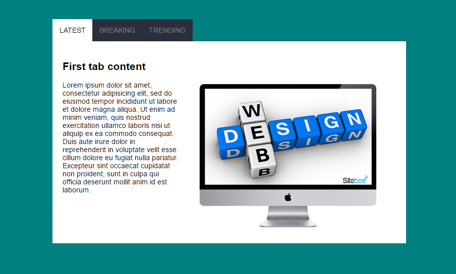
<h2>First tab content</h2>
<p>Lorem ipsum dolor sit amet, consectetur adipisicing elit.</p>
</div><!-- tab-content -->
</div><!-- tab -->
<div class="tab">
<input type="radio" name="tab" id="tab2">
<label for="tab2"><i class="fa fa-th-list"></i> Breaking</label>
<div class="tab-content">
<h2>Second Tab Content</h2>
<p>Lorem ipsum dolor sit amet, consectetur adipisicing elit</p>
</div><!-- tab-content -->
</div><!-- tab -->
<div class="tab">
<input type="radio" name="tab" id="tab3">
<label for="tab3"><i class="fa fa-list"></i> Trending</label>
<div class="tab-content">
<h2>Third Tab Content</h2>
<p>Lorem ipsum dolor sit amet, consectetur adipisicing elit</p>
</div><!-- tab-content -->
</div><!-- tab -->
</div><!-- tab wrapper-->Here the HTML markup structure is simple and clear. We have a wrapping div with the class tab-wrapper which contains all our tabs within it.
Then we add each tab section using another div with a class tab. This is actually our tabs. You can add as many as you want. Here I limited it to only three.
Each tab div contains an input of radio type. Then comes its label. The label targets the input's id with the for attribute. Just under the label we add another div to handle the tab's content. This div can contain any thing. The rest of the work is handled by our css.
style.css
The style file contains all necessary styling to help us have the tab effect.
.tab-wrapper{
    position: relative;
    width: 700px;
    margin: 5% auto;

    display: flex;
    flex-wrap: nowrap;
}

.tab-content{
    position: absolute;
    left: 0;
    margin-left: -1px;

    text-align: left;
    padding: 20px;
    background: white;
    opacity: 0;
    display: none;

    transition: all .5s linear;
}

/** center the tab's label */
.tab{
    text-align: center;
}

.tab label{
    padding: 14px;
    display: block;
    background: #2a2e3e;
    color: grey;
    display: block;
    margin-left: -1px;
    text-transform: uppercase;
    transition: all .5s linear;
}

.tab input[type='radio']{
    display: none;
}

.tab label:hover {
  cursor: pointer; /* make it look like a link */
  background: white;
}

.tab input[type='radio']:checked ~ .tab-content{
    opacity: 1;
    display: block;
}

.tab input[type='radio']:checked ~label{
    background: white;
    color:black;
}

/***********MEDIA QUERY************/

@media all and (max-width: 768px){

    body{
        font-size: 100%;
    }

    .tab-wrapper{
        width: 90%;
        display: block;
    }

    .tab-content{
        max-height: 0;
        position: relative;
    }

    .tab input[type='radio']:checked ~ .tab-content{
        max-height: 100%;
    }

    .tab input[type='radio']:checked ~label{
        border-bottom: 1px solid teal;
    }

    /* Copy right */

    .copyright{
        font-size:11px;
    }

}
This deserves a bit of explanantion. Let me take you through what each part does.
Remember the structure of our HTML markup:
-- .tab-wrapper

     -- .tab

         -- input[type=radio]

         -- label

         -- .tab-content
.tab-wrapper is the container of all tabs. I made as a flexbox and positioned it relatively. I also defined a width even though that is optional.
Making it as a flexbox helps me adjust its items(.tab) and allow them to fit in, and align on the main axis.
Next, I styled the .tab-content by making them absolute. This allows them to go out of the normal flow and go on top of each other. That will help us choose which one to bring on top. I also gave it an zero opacity and hide it with display:none. What this means is,whenever we click on a label, we can choose its related content and display it as a block and give it an opacity of 1.
I went on and styled a bit our labels. This is how we want them to look like. You can decide that on your own based on your case.
Then we hide(display:none) the input radios by targeting them with input[type='radio'].
Next is to show the adequate tab-content based on the label on which we click. To target that content tab we use this:
.tab input[type='radio']:checked ~ .tab-content{
    opacity: 1;
    display: block;
}
Meaning, all input of type radio under the class .tab which is marked as ckecked (on which we click), look for its sibling (~) .tab-content and make ts opacity 1, and display it as a block.
This allows us to alternate different tab contents based on which label we click. Now it's left with marking the clicked label as active tab. To that, we do the same thing with the tab content, but this time we target the sibling label and just change its background color to match the one of the tab content, which gives that effect of active tab.
After this styling I thought of how it will look on small devices. The easiest way I found was to change the tabs into an accordion navigation. You can play with the navigator inspector if you are not on mobile.
Key points
- Repeat as many
tabas the number of tabs you want for your menu - Each radio input should have a different
id - Each
labelshould befora radio - Mark the default active tab as
checkedfrom your HTML - In the
tab-contentyou are free to put any HTML code
Important note
1- Something strange I noticed and I want you to consider is that the order in which you place the radio input and its label matters a lot.
This will work:
<input type="radio" name="tab" id="tab1" checked>
<label for="tab1"><i class="fa fa-th"></i> Latest</label>
And this won't work:
<label for="tab1"><i class="fa fa-th"></i> Latest</label>
<input type="radio" name="tab" id="tab1" checked>
2- The most important thing to keep in mind is the use of css :checked pseudo-class.
3- Hide all input radio buttons
4- The use of the css sibling selector ~ to target elements associated to a label
Further reading
Conclusion
Well, this might not be new but I am expecting to shed more light on this effect.
One thing you could do to improve this is to use a bit of JavaScript cookies to keep the active tab in memory so that even if the user refreshes the browser the active tab will remain active.
Note this uses form element to structure flow content. This might not be adequate in semantic HTML. You should always weight your reasons before opting for such technique.
Here is my demo, you can have a look and compare it with yours.
Please, if this helped you, share it with your friends. That helps me a lot.
Thank you for reading
Last updated 2024-01-11 UTC