Hey! welcome to this special tutorial. Today I am going to make use of gulp, susy, and breakpoint to show you how you can create a simple responsive blog home page.
Click here to preview the demo and have a better feel of what we're going to do.
Before that let me tell you a bit about susy and breakpoint. As far as gulp is concerned, it shouldn't be new for you, and if that's the case head over here to have a look at what it's.
Susy
Susy is a grid system that provides you with a lot of flexibility on how to control your website layout with ease. Susy gives you everything that no other framework like bootstrap or foundation could give you. I will not get the perfect words to describe its power here, there is this post Zell Liew on css-tricks introducing susy and how you can easily build a layout with it.
For this tutorial purpose, let me just show you a bit of how could Susy be used to define a layout. Susy works with SASS, not LESS, and it's also configurable. Here is a simple and minimalist setting you could have:
@import "susy"

/* Changing Susy default global settings */

$susy: (

  /* Set number of columns to 12 columns */
  columns: 12,

  /* Set the main container' with to 1120px */
  container: 1024px

  );
Now let assume that we want a page layout like this current page on which you are reading this tutorial. The page has a header that covers the whole layout, the content side, at the left occupies 8 columns and the side bar occupies 4 columns. To write that with Susy, you could have this:
header{
  @include span(12);
}

.content{
  @include span(8);
}

.content{
  @include span(4);
}
So, simple right? No more hustle.
Breakpoint
No media queries, no responsive design. Breakpoint is a simple module that allows you to use media queries in a simpler and cleaner way. It's designed to help your write your media queries in SASS as fast as possible. Let's see an example of use case:
header{

  @include breakpoint( 320px ){
    background-color: $white;
  }

  @include breakpoint( 768px ){
    background-color: $red;
  }

  @include breakpoint( 1024px ){
    background-color: $black;
  }

}
This will simply change the background color of the header every time the viewport falls in any of these break points. It's as simple as that. Imagine this combined with Susy, we're going to make magic.
Read more about breakpoint-sass here
Project Mockup
Before we go further, let me show you what we really want to do here as an example:
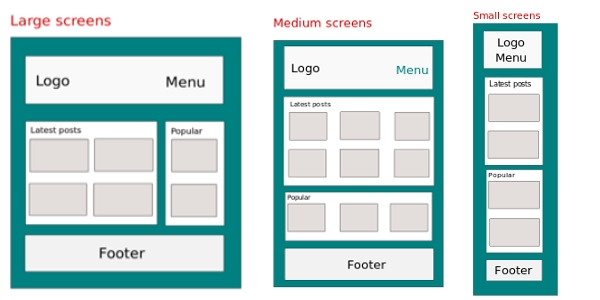
I think you understand the point. Though this concept can be just called an elastic layout, I think it's an appropriate use case to illustrate what we want. If you have to make it fully responsive you have to consider more elements, like change the menu, add/removing the design elements based on the viewport, etc.
Project Set Up
For this project we will be using [gulp build system]() to automate some of our tasks. And we'll also use Bower to manage our packages such us Susy, Breakpoint. So, let's start.
Step 1: create a folder and name it responsive_blog or any name you prefer.
Step 2: cd to the folder and run npm init to set up your package.jason file. Say yes to all the steps.
Setp 3: install gulp locally by running, npm install --save-dev gulp.
Step 4: Also install locally the following gulp plugins - gulp-sass, gulp-minify, gulp-uglify, gulp-rename, gulp-del, browser-sync, etc. by running npm install --save-dev plugin-name-here, or you can just use these dependencies in your package.json file:
"devDependencies": {
    "browser-sync": "^2.9.0",
    "del": "^2.0.0",
    "gulp-autoprefixer": "^2.3.1",
    "gulp-minify-css": "^1.2.1",
    "gulp-plumber": "^1.0.1",
    "gulp-rename": "^1.2.2",
    "gulp-sass": "^2.0.4",
    "gulp-sourcemaps": "^1.5.2"
  }
Step 5: Create one more folder in responsive_blog. Name it src. The src folder will contain our source files.
In order to do so you can run: mkdir src
Step 6: Create a bower.json file by running bower init, and say yes to all steps. Then run bower install susy breakpoint. This will install your bower packages, especially Susy, and Breakpoint-sass.
Step 7: Create your gulpfile.js in the same folder by running touch gulpfile.js
Your project folder should look like this:
- responsive_blog/
- node_modules/
- src/
- bower_components
- bower.json
- gulpfile.js
- package.json
If this looks nice, let's continue.
Step 8: cd to the src folder; create your index file by running touch index.html.
Step 9: Create 2 more folders css, and scss inside src by running mkdir css scss.
Step 10: Inside scss, create a new file and name it styles.scss. From now on your folder should look like this:
- responsive_blog/
- node_modules/
- bower_components/
- src/
- css/
- index.html
- scss/
- styles.scss
- bower.json
- gulpfile.js
- package.json
Great job!
Coding
We've just set up our folders and files. Now let's add some code inside our index.html, gulpfile.js, and styles.scss files:
- index.html
<!DOCTYPE html>
<html>
<head>
<title>Responsive Web Design - Blog</title>
<meta name="charset" content="UTF-8">
<meta name="viewport" content="width=device-width,initial-scale=1.0, maximum-scale=1.0">
<link rel="stylesheet" type="text/css" href="css/styles.min.css">
</head>
<body>
<div class="container">
<header class="">
<h2><a href="" title="">RWD</a></h2>
<nav>
<ul>
<li><a href="" title="">Home</a></li>
<li><a href="" title="">About</a></li>
<li><a href="" title="">Contact</a></li>
</ul>
</nav>
</header><!-- /header -->
<div class="page-content">
<section class="latest-posts">
<h1>Latest tutorials</h1>
<article>
<!-- this is a blog post -->
<h2><a href="" title="">How to create a blog?</a></h2>
<p>This shows you how you can create your own blog.
<a href="" rel=bookmark>Read more</a></p>
<footer>
By zooboole | 7k views
</footer>
</article>
<article>
<!-- this is a blog post -->
<h2><a href="" title="">How to create a blog?</a></h2>
<p>This shows you how you can create your own blog.
<a href="" rel=bookmark>Read more</a></p>
<footer>
By zooboole | 7k views
</footer>
</article>
<article>
<!-- this is a blog post -->
<h2><a href="" title="">How to create a blog?</a></h2>
<p>This shows you how you can create your own blog.
<a href="" rel=bookmark>Read more</a></p>
<footer>
By zooboole | 7k views
</footer>
</article>
<article>
<!-- this is a blog post -->
<h2><a href="" title="">How to create a blog?</a></h2>
<p>This shows you how you can create your own blog.
<a href="" rel=bookmark>Read more</a></p>
<footer>
By zooboole | 7k views
</footer>
</article>
</section><!-- /section -->
<aside class="popular-posts">
<h1>Popular</h1>
<article>
<!-- this is a blog post -->
<h2><a href="" title="">How to create a blog?</a></h2>
<p>This shows you how you can create your own blog.
<a href="" rel=bookmark>Read more</a></p>
<footer>
By zooboole | 7k views
</footer>
</article>
<article>
<!-- this is a blog post -->
<h2><a href="" title="">How to create a blog?</a></h2>
<p>This shows you how you can create your own blog.
<a href="" rel=bookmark>Read more</a></p>
<footer>
By zooboole | 7k views
</footer>
</article>
<article>
<!-- this is a blog post -->
<h2><a href="" title="">How to create a blog?</a></h2>
<p>This shows you how you can create your own blog.
<a href="" rel=bookmark>Read more</a></p>
<footer>
By zooboole | 7k views
</footer>
</article>
</aside><!-- /aside -->
</div>
<footer class="footer">
2015 © Responsive Blog, by <a href="http://zooboole.me">zooboole</a>
</footer><!-- /footer -->
</div>
<script src="bower_components/jquery/dist/jquery.js" type="text/javascript" charset="utf-8"></script>
<script src="bower_components/breakpoint/jquery.breakpoint.js" type="text/javascript" charset="utf-8"></script>
</body>
</html>- styles.scss
  @import "../bower_components/susy/sass/_susy.scss";
  @import "../bower_components/breakpoint-sass/stylesheets/breakpoint";

  @import "reset";
  @import "variables";

  //Susy Maps
  $susy: (
    columns: 12,
    gutters: 1/2,
    math: fluid,
    gutter-position: outside,
  );

  html,body{

    font-family: $font-family-default;
    font-size:$font-size-default;
    line-height:$line-height;
    color:$color-text;
    background-color: $color-background;

    margin:0;
    padding:0;

    overflow-x:hidden;
  }

  a{
    text-decoration: none;
  }

  .container{

    @include container($container);

    background-color:$white;
  }

  .page-content{
    padding:3%;
    margin:0;
  }

  // ***********************************
  // SMALL DEVICES
  // ***********************************
  @include breakpoint($breakpoint-small)
  {

    h1{
        color: $color-secondary;
        font-size: $font-size-title;
    }

    h2{
        font-size: 1.2em;
        margin:0;
        padding:0;
    }

    // Site header
    header{
        @include span(12);
        background-color:$color-secondary;
        padding:0 1%;
        color: $white;
        // padding:1em;
        h2{
            @include span(12);
            font-size: 1.5em;
            padding:0 0.4em;
        }
        nav{
            @include span(12);
        }
        ul{
            list-style-type: none;
            padding:0;
            margin:0;
            padding-left:0.1em;
            li{
                display: inline-block;
                a{
                    font-size: 1em;
                    display: block;
                    padding: 0.5em;
                }
            }

        }

        a{
            color: $white;
            &:hover{
                color: $black;
            }
        }
    }

    // featured/ latest posts section
    .latest-posts{
        @include span(12);

        article{
            border:1px solid $color-background;
            padding:0.5em;
            margin-bottom: 1em;
            p{
                font-size: 0.9em;
            }

            a{
                color: darken($color-background, 25%);
            }
            footer{
                font-size: 0.9em;
                color:#333;
            }
        }
    }

    // Popular posts  section
    .popular-posts{
        @include span(12);

        article{
            background-color:lighten($color-background, 5%);
            border:1px solid $color-background;
            padding:0.5em;
            margin-bottom: 1em;
            a{
                color: darken($color-background, 20%);;
            }
        }

    }

    // Footer section
    .footer{
        @include span(12);
        background-color:$color-secondary;
        font-size: 1em;
        padding:0.5em 1%;
        color: $white;

        a{
            color:lighten( $color-primary, 22%);
            &:hover{
                color: $black;
            }
        }
    }
  }

  // ***********************************
  // MEDIUM DEVICES
  // ***********************************
  @include breakpoint($breakpoint-medium)
  {

    // Here we just change what need to be modified
    // because the previous style applies itself automatically

    // Site header
    header{
        @include span(12);
        background-color:$color-primary;

        h2{
            @include span(3);
            font-size: 3em;
        }
        nav{
            @include span(8);
        }
        ul{
        text-align: right;
            margin-top:0.4em;
            li{
                a{
                    font-size: 1.7em;
                }
            }

        }

    }

    // featured/ latest posts section
    .latest-posts{
        @include span(6);
        article{
            h2{
                font-size: 1.8em;
            }
            border:1px solid $color-background;
            padding:0.5em;
            margin-bottom: 2em;
            clear: both;
            p{
                font-size: $font-size-default+50;
            }

            a{
                color: darken($color-background, 25%);
            }
            footer{
                font-size: 1.3em;
            }
        }
    }

    // Popular posts  section
    .popular-posts{
        @include span(6);
        padding-left:1em;
        article{
            h2{
                font-size: 1.8em;
            }
            background-color:lighten($color-background, 2%);
            border:1px solid transparent;
            padding:0.5em;
            margin-bottom: 1em;
            p{
                font-size: $font-size-default+50;
            }
            a{
                color: darken($color-background, 20%);;
            }
            footer{
                font-size: 1.3em;
            }
        }
    }
    // Footer section
    .footer{
        @include span(12);
        background-color:$color-primary;
        font-size: 1.5em;
    }
  }

  // ***********************************
  // LARGE DEVICES
  // ***********************************
  @include breakpoint($breakpoint-large)
  {

    // Here we just change what need to be modified
    // because the previous style applies itself automatically

    // Site header
    header{
        @include span(12);
        background-color:lighten($color-primary, 15%);
        padding:0%;
    }

    // featured/ latest posts section
    .latest-posts{
        // by living it empty, it means the previous viewport style will be applied
    }

    // Popular posts  section
    .popular-posts{
        @include span(6);
        padding-left:1em;
        article{
            h2{
                font-size: 1.8em;
            }
            background-color:lighten($color-background, 2%);
            border:1px solid transparent;
            padding:0.5em;
            margin-bottom: 1em;
            p{
                font-size: $font-size-default+50;
            }
            a{
                color: darken($color-background, 20%);;
            }
            footer{
                font-size: 1.3em;
            }
        }
    }

    // Footer section
    .footer{
        padding:0em;
        background-color:lighten($color-primary, 15%);
    }
  }
- gulpfile.js
// ////////////////////////////////////////////////
//
// Included taskes
//
// // /////////////////////////////////////////////

var gulp            = require('gulp'),
    minifycss       = require('gulp-minify-css'),
    sass            = require('gulp-sass'),
    browserSync     = require('browser-sync'),
    reload          = browserSync.reload,
    autoprefixer    = require('gulp-autoprefixer'),
    plumber         = require('gulp-plumber'),
    del             = require('del'),
    rename          = require('gulp-rename'),
    sourcemaps      = require('gulp-sourcemaps');

// ////////////////////////////////////////////////
//
// Configuration variables
// Set paths
//
// // /////////////////////////////////////////////

var config = {
                scss    :[ 'src/scss/**/*.scss' ],
                css     :[ 'src/css/' ],
                html    :[ 'src/**/*.html' ],
                build   :[ 'build/' ],
                src     :[ 'src/' ]
            };

// ////////////////////////////////////////////////
//
// Styles / Sass Tasks
//
// // /////////////////////////////////////////////

gulp.task('styles',function(){

 return gulp.src(config.scss)
            .pipe(sourcemaps.init())
            .pipe(sass()
            .on('error', sass.logError))
            .pipe(autoprefixer('last 3 versions'))
            .pipe(minifycss())
            .pipe(rename({suffix: '.min'}))
            .pipe(sourcemaps.write())
            .pipe(gulp.dest(''+config.css+''))
            .pipe(reload({stream:true}));

});

// ////////////////////////////////////////////////
//
// HTML Tasks
//
// // /////////////////////////////////////////////

gulp.task('html', function(){
    return gulp.src(config.html)
               .pipe(reload({stream:true}));
});

// ////////////////////////////////////////////////
//
// Browser-Sync Tasks
//
// // /////////////////////////////////////////////

gulp.task('browserSync', function() {
    browserSync({
        server: {
            baseDir: config.src
        }
    });
});

// ////////////////////////////////////////////////
//
// Build Tasks
// Create build, clean un-neccesary files and folders
//
// // /////////////////////////////////////////////

// create build
gulp.task('build:create', function(){
    return gulp.src(config.src+'**/*')
               .pipe(gulp.dest(''+config.build+''));
});

// Clean build folder
gulp.task('build:clean',['build:create'], function(){
    return del(['build/bower_components/',
                'build/scss/',
                'build/css/!(*.min.css)',
                'build/js/!(*.min.js)'
              ]);
});

// preview build app Tasks
gulp.task('build:start', function() {
    browserSync({
        server: {
            baseDir: config.build
        }
    });
});

// remove build folder
gulp.task('build:delete', function(res){
    return del([config.build+'/**'], res);
});

 // build task
 gulp.task('build', ['build:create', 'build:clean']);

// ////////////////////////////////////////////////
//
// Watch Tasks
// Watch any changes of the css, scripts, and html
//
// // /////////////////////////////////////////////

gulp.task ('watch', function(){

  gulp.watch(config.scss, ['styles']);

  gulp.watch(config.html, ['html']);

});

// ////////////////////////////////////////////////
// Gulp Default task
// ///////////////////////////////////////////////

gulp.task('default', ['watch', 'browserSync','styles','html']);
Read me
Good. We've developed different parts of the project. It's left with how to run it. As you may have noticed from the gulpfile.js, we just have to put our tasks into work.
There are two cases to consider:
- Development
That's while were are still coding and changing things in the code. In our case now just run:
gulpIf you are using [my files](), run following:
npm install

bower install

gulp
This will download all plugins for your gulp file, and all packages required, then it will run your gulp tasks which will start watching any changes you make and automatically reload the page for you.
If you want to see how I got the paths to susy and breakpoint, run bower list --path.
But there is something I notices with breakpoint. You have to use
breakpoint-sassinstead ofbreakpoint. When you are importing it in your styles be careful.
- Production
When you are done coding and you want to have a final product. We have tasks for that in our gulpfile -build tasks.
To use it, run the following commands:
-
Create the build application:
gulp build
-
launch the final application:
gulp build:start
-
If you want to delete the build folder:
gulp build:delete
Conclusion
This is just an example of how I would have proceeded if had to build such website. It's one workflow and technic amongst many. I am expecting you to learn four main things in this tutorial: the workflow with gulp build system, how to build a responsive website, how susy and breakpoint allow us to have a semantic HTML, and how to go mobile first when designing a responsive website.
I admit I have omitted a lot in these codes, know that it,s for clarity purpose and sometimes I myself didn't figure out how to handle it, because I am still learning how to use susy and breakpoint very well. If you have any idea of how to improve something, I am a happy taker.
Above all this you should also be aware of the existence of Susy and Breakpoint for your next project. They are great tools that can make your life easier.
For any question or any plus, you can just comment under this tutorial. If you like it, please do allow your friends to know about it by sharing. I will appreciate.
Last updated 2024-01-11 UTC
7 Comments
Sign in to join the discussion


Error in plugin 'sass'
Message:
src/scss/styles.scss
Error: File to import not found or unreadable: ../bower_components/susy/sass/_susy.scss
Parent style sheet: stdin
on line 1 of stdin
>> @import "../bower_components/susy/sass/_susy.scss";
Error in plugin 'sass'
Message:
src/scss/styles.scss
Error: File to import not found or unreadable: ../bower_components/susy/sass/_susy.scss
Parent style sheet: stdin
on line 1 of stdin
>> @import "../bower_components/susy/sass/_susy.scss";
^
- Are you sure your bower components folder is `bowercomponents` instead of `bower_components` ?
- Use full path, like `http://127.0.0.1:9000/public/bower_components/susy/sass/susy.scss`
If any other thing let us know by providing more details.
I got an error on @import "reset" running gulp,
which bower or npm dependency do I need to be able to use this import?
thanks