Let's learn a bit how to create fixed elements and components on a web page with vanilla Javascript. Fixing elements on a web page is a strategy we often meet on websites. It's used for many purposes including side and top menus, fixing a side note, fixing side ads, fixing table of contents, fetching/revealing more content at some point of the window scroll, and so on.
In this article, I would like to take you through how that is done with vanilla JavaScript. The concept varies from one person to another and from one code base(context) to another. My idea here is to help you understand the core concept around it. That way whenever you face such situation you would know the least skill you need to complete the task.
Before I start, let's look at the following image:
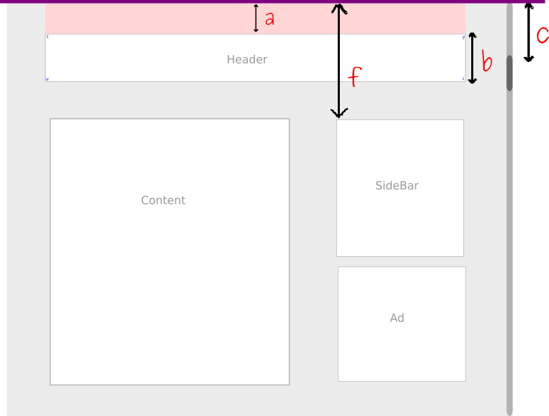
To illustrate it, I will use that as our context work. On this page, we have a simple layout which is made of a header, the main content column, and a sidebar. Before the header, we can notice a neutral zone in pink. The purple line on top of the pink zone is to show the window's limit. Any content that passes that line is no longer visible on the window. It's off-screen.
In the second demo of this article, I pushed that a bit further by adding a third column.
Right now, the header is at a distance from the purple line. Let's assume we want the header to get fixed at the moment it hit that line. Somehow it means when a == 0
To do that, we need to know how far the window scroll has gone so far. In this case, I used the main window. This could be a scroll of an element with overflow: auto to help it have scroll bars. I denoted the main window scroll with the letter c. Once the page is loaded, the window's scroll bar is at its initial position ‐the top. At that position, the c value is 0.
To know if the header has reached the purple line we have to check if the window's scroll has reached the a pixels which is equal to the distance separating the header from the purple line. We can write the following formula:
c - a = 0
c = a
If we want to fix the sidebar at the same location, we would have this:
c - f = 0
c = f
a and b being the respective offsets of the header and the sidebar. The idea here is to check if the window scroll has reached the distance separating that element from the top. A distance also called the offset on the Y axis.
Note: if the pink zone wasn't there,
awould be0
How to get the window scroll?
Let's assume the variable header contains the header element:
<script>

   var scroll =  window.offsetY

</script>
How to get the offset of an element?
<script>

   var headerOffsetTop =  header.offsetTop

</script>
Putting these two together
<script>

    var header          = document.querySelector('.header')
    var scroll          = window.offsetY
    var headerOffsetTop = header.offsetTop

    if (scroll >= headerOffsetTop) {
        // fix element
    } else {
        // remove fix
    }

</script>
Whenever this equation is verified, the header should be applied the required CSS to fix it.
Note: Our formula was
c = 0, but I just wrotec >= a. If I keep only the=the fixing would happen at one moment: instantly and return to the initial state. By using the>=means from the moment it's equal and above, stay fixed.
The jumping issue after fixing an element
Once the header is fixed, it goes out of the document normal flow. A behavior you probably know from CSS. Any element floated, positioned absolute or fixed loses its space and thus create an empty hole. If you keep it that way, you will notice that the bellow content jumps up a bit. Precisely, it jumps of b pixels which are the height of the header. It becomes like the header element has been removed.
To solve that problem, there are few ways to go about it.
-
The first and most obvious is to dynamically create a virtual/empty tag of the same hight to take that place temporarily.
-
The second option is to add an extra padding of the same height to the main container I tend to like the first option because when we are fixing more than one item, we can just add the virtual tag on top of each element. unlike we the padding, we could end up piling the padding spaces on top of each other causing a huge space.
Basically, whenever the fixing breaks in the document's flow, you need to fix it in order to keep the structure in the same shape.
Losing the element's normal width after fixing it
Besides, if the element fixed had a width, it might lose that width and probably take an automatic width.
To fix that, you need to get the element's width before then update once it looses the with.
<script>

    var rect = header.getBoundingClientRect()

</script>
The rect variable contains the different cords of the header as a rectangle. This gives the top or x on our illustration, right or y on the image, bottom for z, and left for w. Besides to those, we also have access to the height which is equal to b. Notice that we could have used this height to set the height of that virtual tag i mentioned above. And, we also have the width. This gives a lot of information about the element which we can use for our calculus.
To reset the element's width we can write this:
<script>

    var rect = header.getBoundingClientRect()

    header.style.width = parseInt(rect.width) + 'px'

</script>
Note: Through the
rectvariable we could also access the location of the element on the planned axis:xandy. Theymoves from positive values (while it's still in the viewport) to negative values(when it goes out of the viewport -offscreen). We could also use those for our calculus.You could also use CSS properties to fix the width issue. You can set the
top,left, andrightto0
Stick many elements in the same document
In general, you might think of selecting each element, get its details and apply whatever update on the scroll.
This can be complicated and tedious to do especially when the elements are many or you can't even tell how many they are ahead.
One good way to do this is to add some sort of tags to those elements which need to be fixed. One good tool for this is the HTML data- attribute. We could add a data-sticky to all elements. Then in our JavaScript, we have to go through all the elements and apply whatever calculation we want to do.
<div class="someClass" data-sticky>Some text</div>
<div class="someClass">Some text</div>
<div class="someClass" data-sticky>Some text</div>

<script>

    var elementsToStick = document.querySelectorAll('[data-sticky]')

    for (var i = 0; i < elements.length; i++) {
        // operations applied to each element[i]
    })

</script>
Here too, figuring out various offsets can become complicated because the elements can be in different locations. Imagine there are many other elements before an element to stick. This can involve a lot to determine the offsets.
Besides, setting the offsets automatically through the calculation can be a bit uncomfortable. Imagine you want to specify from what position exactly the element should get fixed. Because all this time I have been talking about fixing elements relative to the top. Imaging they all don't have to reach the top before they get fixed. You can decide when to fix a given element.
One good idea would be to set the offsets manually from the HTML elements themselves. Once again, we can use the data- attribute to solve that problem:
<div class="someClass" data-sticky>Header</div>
<div class="someClass">Some text</div>
<div class="someClass" data-sticky data-offset="70">Side bar</div>

<script>

    var elementsToStick = document.querySelectorAll('[data-sticky]')

    for (var i = 0; i < elements.length; i++) {
        // operations applied to each element[i]

        // Get offset attribute
        var offset = element[i].getAttribute('data-offset')

        if (scroll >= offset) {
            // fix element
        } else {
            // remove fix
        }

    })

</script>
With this, we can change the offset by editing the HTML element offset.
This code will run once. We need to add an event listener in the
forloop to fix only on scroll
Some practical cases: Sticking one element
In this example I am going to build a sample website with its navigation getting sticky at the moment it hits the top of the screen. You can check out the final project here.
The HTML
<!doctype html>
<html>
    <head>
        <meta charset="utf-8">
        <meta name="description" content="Learn how to create sticky items with Vanila Javascript">
        <meta name="viewport" content="width=device-width, initial-scale=1">
        <title>The science of fixing elements with Vanila Javascript</title>
        <link rel="stylesheet" href="css/style.css">
    </head>
    <body>
            <div class="pinkzone">
                <p>Pink zone</p>
                (<small>Scroll the page</small>)
            </div>
            <header class="header">
                <ul>
                    <li><a href="">Logo.</a></li>
                    <li><a href="">Home</a></li>
                    <li><a href="">About</a></li>
                    <li><a href="">Contact</a></li>
                </ul>
            </header>
            <div class="content">
                <h2>Let's do some sticking with Javascript</h2>
                <p>Once the header is fixed, it goes out of the document normal flow. A behavior you probably know from CSS. Any element floated, positioned absoluetely or fixed looses its space and therefor create an empty hole. If you keep it that way, you will notice that the bellow content jumps up a bit. Precisely, it jumps of `b` pixels which is the height of the header. It becomes like the header element has been removed.</p>
                <p>Lorem ipsum dolor sit amet, consectetur adipisicing elit. Ipsam sed quos explicabo, inventore excepturi eligendi, facilis odio ullam at consectetur totam sunt saepe, eaque repellendus ipsum modi dolore sit ratione?</p>
                <p>Lorem ipsum dolor sit amet, consectetur adipisicing elit. Eius dolorem ab voluptatum expedita pariatur, at perspiciatis necessitatibus culpa accusantium hic iste minus, ratione iure est excepturi officiis inventore consequatur quos.</p>
                <p>Lorem ipsum dolor sit amet, consectetur adipisicing elit. Eius dolorem ab voluptatum expedita pariatur, at perspiciatis necessitatibus culpa accusantium hic iste minus, ratione iure est excepturi officiis inventore consequatur quos.</p>
                <p>Lorem ipsum dolor sit amet, consectetur adipisicing elit. Nesciunt molestias laboriosam, deleniti dolor blanditiis necessitatibus cum maxime? Amet in, ullam voluptates qui ipsum consectetur vero quia debitis id dicta, minima?</p>
            </div>

            <footer>© 2018 all rights reserved - Designed by <a href="http://zooboole.me" target="_blank">zooboole</a></footer>
        <script src="js/main.js"></script>
    </body>
</html>
The CSSS
* {
    box-sizing: border-box;
}
html, body {
    margin:0;
    padding:0;
    overflow-x: hidden;
}

body {
    font-size: 16px;
    line-height: 1.7rem;
    font-family: "Roboto", Anton, verdana, sans-serif;
    background-color: #efefef;
    color: #555;
    min-height: 3000px; // to create the scroll bar
}

a {
    text-decoration: none;
    color: orange;
}

p {
    margin-bottom: 2.5rem;
}

/*STICK CLASS*/
.stick .header {
    position: fixed;
    top:0;

    /*These can be omitted*/
    /*left: 0;*/
    /*right: 0;*/
}

.pinkzone {
    background-color: pink;
    background: linear-gradient(to right, pink, orange);
    background-image: url('../img/linux.jpg');
    background-repeat: no-repeat;
    background-size: cover;
    background-attachment: fixed;
    /*padding: 19rem 0;*/
    min-height: 80vh;
    margin: 0;
    padding: 5rem 0;

    text-align: center;
    font-size: 2rem;
    color: pink;
}

header.header {
    margin:0;
    padding:0;
    background-color: white;
    box-shadow: 0px 2px 7px #ddd;
    transition: all 0.5s ease-out;
}

.header ul, .header li {
    margin:0;
    padding: 0;
    list-style-type: none;
}

.header ul li:hover {
    background-color: black;
    transition: all 1s ease-in-out;
}
.header ul {
    display: flex;
    justify-content: center;
}
.header ul a {
    display: block;
    padding: 0.7rem 1rem;
    font-size: 1.2rem;
    text-transform: uppercase;
    border-right: 1px solid #ddd;
    color: pink;
    transition: all 0.3s ease-out;
}

.header ul a:hover {
    color: orange;
}
.header ul li:first-child a {
        border-left: 1px solid #ddd;
}

.content {
    width: 40%;
    margin: 10px auto;
    background-color: white;
    padding: 35px;
}

footer {
    text-align: center;
    width: 40%;
    margin: 10px auto;
    padding: 1rem 0;
    border-bottom: 1px solid #ddd;
}

@media screen and (max-width: 780px) {
    .pinkzone {
        padding: 5rem 0;
    }
    header.header {
        width: 90%;
        margin: 0 5%;
    }
    .header ul li:last-child a {
        border: 0!important;
    }
    .header ul li:first-child a {
        border-left: 0;
    }
    .header ul a {
        font-size: 100%;
    }
    .content {
        width: 90%;
    }
}
The JS
(function(){
    "use strict"
    console.log('%c Ready. Scroll Now!', 'color:darkred')

    // Get the navigation element
    var navBar = document.querySelector('.header')
    var offset = navBar.offsetTop
    var rect   = navBar.getBoundingClientRect()

    // Create a virtual element
    var virtualElement = document.createElement('div')
    // Style it by giving it the height of the header
    virtualElement.style.height = parseInt(rect.height) + 'px'

    // Create the function to be called on scroll
    var stick = function () {

        // Get the scroll
        var scroll = window.scrollY

        // check if the body element alreadyhas the stick class
        var isSticked = document.body.classList.contains('stick')

        // We do the operation if only the body element doesn't have the stick class
        // otherwise the scroll event consumes a lot of resourses
        if ( scroll >= offset && !isSticked) {

            document.body.classList.add('stick')
            navBar.style.width = parseInt(rect.width) + 'px'

            // We add a padding-top to compensiate the header's space
            // document.body.style.paddingTop = parseInt(rect.height) + 'px'

            // Using virtual element to replace of floating object
            navBar.parentNode.insertBefore(virtualElement, navBar)
        } else if(scroll <= offset && isSticked){
            document.body.classList.remove('stick')
            navBar.style.width = 'auto'

            // reset the padding if we added it
            // document.body.style.paddingTop = '0px'

            // Removing the virtual element
            var formerFirstChild = document.body.removeChild(virtualElement);
        }
    }

    // listen to the scroll
    window.addEventListener('scroll', stick)
})()
Some practical cases: Sticking many elements on a page
The HTML
<!doctype html>
<html>
    <head>
        <meta charset="utf-8">
        <meta name="description" content="Learn how to create sticky items with Vanila Javascript">
        <meta name="viewport" content="width=device-width, initial-scale=1">
        <title>The science of fixing elements with Vanila Javascript</title>
        <link rel="stylesheet" href="css/style.css">
    </head>
    <body>
            <div class="pinkzone">
                <p>Pink zone</p>
                (<small>Scroll the page</small>)
            </div>
            <header class="header" data-sticky>
                <ul>
                    <li><a href="">Logo.</a></li>
                    <li><a href="">Home</a></li>
                    <li><a href="">About</a></li>
                    <li><a href="">Contact</a></li>
                </ul>
            </header>
            <div class="container">
                <div class="table-content">
                    <div class="stickable"  data-sticky data-offset="550">
                        <h3>Table of content</h3>
                        <ul>
                            <li><a href="">Link 1</a></li>
                            <li><a href="">Link 2</a></li>
                            <li><a href="">Link 3</a></li>
                            <li><a href="">Link 4</a></li>
                            <li><a href="">Link 5</a></li>
                            <li><a href="">Link 6</a></li>
                            <li><a href="">Link 7</a></li>
                        </ul>
                    </div>
                </div>
                <div class="content">
                    <h2>Let's do some sticking with Javascript</h2>
                    <p>Once the header is fixed, it goes out of the document normal flow. A behavior you probably know from CSS. Any element floated, positioned absoluetely or fixed looses its space and therefor create an empty hole. If you keep it that way, you will notice that the bellow content jumps up a bit. Precisely, it jumps of `b` pixels which is the height of the header. It becomes like the header element has been removed.</p>
                    <p>Lorem ipsum dolor sit amet, consectetur adipisicing elit. Ipsam sed quos explicabo, inventore excepturi eligendi, facilis odio ullam at consectetur totam sunt saepe, eaque repellendus ipsum modi dolore sit ratione?</p>
                    <p>Lorem ipsum dolor sit amet, consectetur adipisicing elit. Eius dolorem ab voluptatum expedita pariatur, at perspiciatis necessitatibus culpa accusantium hic iste minus, ratione iure est excepturi officiis inventore consequatur quos.</p>
                    <p>Lorem ipsum dolor sit amet, consectetur adipisicing elit. Eius dolorem ab voluptatum expedita pariatur, at perspiciatis necessitatibus culpa accusantium hic iste minus, ratione iure est excepturi officiis inventore consequatur quos.</p>
                    <p>Lorem ipsum dolor sit amet, consectetur adipisicing elit. Nesciunt molestias laboriosam, deleniti dolor blanditiis necessitatibus cum maxime? Amet in, ullam voluptates qui ipsum consectetur vero quia debitis id dicta, minima?</p>
                </div>
                <div class="social">
                    <div class="stickable" data-sticky>
                        <h3>Share</h3>
                        <ul>
                            <li><a href="">Twitter</a></li>
                            <li><a href="">Facebook</a></li>
                        </ul>
                    </div>
                    <div class="stickable" data-sticky data-offset="595">
                        Ads
                    </div>
                </div>
            </div>

            <footer>© 2018 all rights reserved - Designed by <a href="http://zooboole.me" target="_blank">zooboole</a></footer>
        <script src="js/main.js"></script>
    </body>
</html>
The CSSS
* {
    box-sizing: border-box;
}
html, body {
    margin:0;
    padding:0;
    overflow-x: hidden;
}

body {
    font-size: 16px;
    line-height: 1.7rem;
    font-family: "Roboto", Anton, verdana, sans-serif;
    background-color: #efefef;
    color: #555;
    min-height: 3000px; // to create the scroll bar
}

a {
    text-decoration: none;
    color: orange;
}

p {
    margin-bottom: 2.5rem;
}

/*STICK CLASS*/
.stick {
    /*position: fixed;*/
}
.pinkzone {
    background-color: pink;
    background: linear-gradient(to right, pink, orange);
    background: linear-gradient(180deg, #552660,#2f0045);
    background-repeat: no-repeat;
    background-size: cover;
    background-attachment: fixed;
    /*padding: 19rem 0;*/
    min-height: 50vh;
    margin: 0;
    padding: 5rem 0;

    text-align: center;
    font-size: 2rem;
    color: pink;
}

header.header {
    margin:0;
    padding:0;
    background-color: white;
    box-shadow: 0px 2px 7px #ddd;
    transition: all 0.5s ease-out;
}

.header ul, .header li {
    margin:0;
    padding: 0;
    list-style-type: none;
}

.header ul li:hover {
    background: linear-gradient(180deg, #2f0045, #552660);
    transition: all 1s ease-in-out;
}
.header ul {
    display: flex;
    justify-content: center;
}
.header ul a {
    display: block;
    padding: 0.7rem 1rem;
    font-size: 1.2rem;
    text-transform: uppercase;
    border-right: 1px solid #ddd;
    color: pink;
    transition: all 0.3s ease-out;
}

.header ul a:hover {
    color: orange;
}
.header ul li:first-child a {
        border-left: 1px solid #ddd;
}

.container {
    display: flex;
    justify-content: space-around;
    align-content: stretch;
    align-items: center;
    width: 80%;
    margin: 0 auto;
}
.content {
    width: 40%;
    margin: 10px auto;
    background-color: white;
    padding: 35px;
}

.social {
    margin-top: 100px;
    width: 20%;
}

.social ul, li{
    margin: 0;
    padding: 0;
}

.social li {
    list-style-type: none;
    display: inline-block;
}
.social li a {
    display: block;
    border-radius: 25px;
    padding: 0.3rem 0.7rem;
    border: 1px solid lightblue;
    color: lightblue;

}
.stickable {
    position: relative;
    background-color: #fff;
    padding: 1.5rem;
}

.table-content {
    width: 20%;
}

.table-content ul {
    margin:0;
    padding:0;
}

.table-content ul li {
    list-style-type: none;
}

.table-content ul li a {
    display: block;
    padding: 0.7rem 1rem;
}

footer {
    text-align: center;
    width: 40%;
    margin: 10px auto;
    padding: 1rem 0;
    border-bottom: 1px solid #ddd;
}

@media screen and (max-width: 780px) {
    .pinkzone {
        padding: 1rem 0;
        min-height: 20vh;
    }
    header.header {
        width: 100%;
        z-index: 2;
    }

    .header ul li:last-child a {
        border: 0!important;
    }
    .header ul li:first-child a {
        border-left: 0;
    }
    .header ul a {
        font-size: 100%;
    }

    .container {
        width: 100%;
        flex-flow: row wrap;
    }
    .content {
        width: 100%;
    }
    .table-content {
        width: 100%;
        margin-top: 10px;
        z-index: 0;
    }
    .table-content ul {
        display: flex;
        justify-content: space-between;
        flex-flow: row wrap;
    }
    .table-content ul a {
        display: block;
        padding: 0.5rem 0.7rem;
    }

    .stickable, .social {
        background-color: #e84393;
        color: #ffffff;
        z-index: 6;
        width: 100%;
    }

    footer {
        width: 100%;
    }
}
The JS
(function(){
    "use strict"
    console.log('%c Ready. Scroll Now!', 'color:darkred')

    // Get the navigation element
    var elements = document.querySelectorAll('[data-sticky]')

        for (var i = 0; i < elements.length; i++) {
            (function(element){

                var offset         = element.offsetTop // automatically calculated offset
                var variableOffset = parseInt(element.getAttribute('data-offset')) || offset // offset defined in HTML data-offset
                var rect           = element.getBoundingClientRect()

                const offsetToUse  = variableOffset

                // Create a virtual element
                var virtualElement = document.createElement('div')

                // Style it by giving it the height of the header
                virtualElement.style.height = parseInt(rect.height) + 'px';

                // Create the function to be called on scroll
                var stick = function () {
                    // Get the scroll
                    var scroll = window.scrollY
                    // check if the body element already has the stick class
                    var isSticked = element.classList.contains('stick')

                    // We do the operation if only the body element doesn't have the stick class
                   // otherwise the scroll event consumes a lot of resourses
                    if ( scroll >= offsetToUse && !isSticked) {
                        // We can't apply the css style to all, so we disable
                        element.classList.add('stick')
                        element.style.position= 'fixed'
                        element.style.top = offset - variableOffset + 'px'
                        element.style.width = parseInt(rect.width) + 'px'

                        //  We add a padding-top to compensiate the header's space
                        // document.body.style.paddingTop = parseInt(rect.height) + 'px'

                        // Using virtual element to replace of floating object
                        element.parentNode.insertBefore(virtualElement, element)

                    } else if(scroll <= offsetToUse && isSticked){
                        element.classList.remove('stick')
                        element.style.position = 'inherit' // regain the flow
                        // reset the padding if we added it
                        // document.body.style.paddingTop = '0px'

                        //  Removing the virtual element
                        var formerFirstChild = element.parentNode.removeChild(virtualElement);
                    }

                }

                // listen to the scroll
                window.addEventListener('scroll', stick)
            })(elements[i])

        }

})()
OK, let's take a second and try to understand some points here.
First, all elements that are supposed to be fixed receive a data-sticky attribute. Then I defined a data-offset="" to set the position at which the specified element can be fixed. When the data-offset="" attribute is not set and the element has data-sticky, we assume its offset is 0. It will thus be fixed on top.
Then comes the selection of all elements involved:
var elements = document.querySelectorAll('[data-sticky]')This is like a CSS attribute selector. Select all elements with the attribute [data-sticky].
Then, follows a for loop to help me go though each element:
for (var i = 0; i < elements.length; i++)After that I used an Immediately-invoked function expression (IIFE) to isolate the namespace for each element.
( )(elements[i])Every time we go through an element, this function is called automatically. By passing it the current element, all operations which can use that element
(function(element){})(elements[i])Within the inner function of the IIFE, the element is elements[i]
Once inside, we do the same processing just as if we had one element. But, you need to look at some lines inside.
var variableOffset = parseInt(element.getAttribute('data-offset')) || offsetThis line gets the offset set in the HTML. In case that offset is not indicated, we use the default offset. This helps later on when we calculate the top offset to which we should fix the element:
element.style.top = offset - variableOffset + 'px'In case the offset is not indicated in the HTML, variableOffset == offset. We will have offset - offset = 0. So, the element gets fixed on top by default. This is especially useful for the header.
Another important line is this:
element.style.position = 'inherit'It's used in the else statement to help reinitialize the element's position after we remove the fixing. Strange enough, this would not work if you don't set it to inherit. You need to pay attention to that.
Limits
While this is very flexible, I have noticed a few limitations that could serve as an improvement.
- Offsets are not compatibles between small and large devices
- Possibility of set the offset in a more dynamic way so that it can be set for various viewports
- Element width is not automatically adjusted when you change from one viewport to another without refreshing the page.
Check out the demos:
Yes. Let's stop here for now. That was long. I hope that your time wasn't in vain and that you would learn something out of it.
Leave a comment for any suggestion or corrections.
Thanks for reading.
Cover image credit to www.taplytics.com
Last updated 2024-01-11 UTC